Sunday, June 13, 2010

**On The Beach You Can Live In Bliss**


“The waves of the sea
Help me get back to me.”
-Jill Davis

Thursday, May 20, 2010

Mark Lyon Impressions


These show the reality in the front and the falsity behind:)

Monday, May 17, 2010

Aperature

Mark Lyon:

Title: Landscapes for the People


Artist info and background:


Mark was one of the 5 runner ups in the 2009 Aperture portfolio prize.


Image styles and subjects:


Most of his pictures are of landscapes in vivid color and disorienting thoughts. His photos look like images that would be in a calender about nature. They are of pictures you would see in a dentist office or an airport. For example, a picture behind family photos in someone's house, in an airport, in a doctor's /dentist's office, or in a cafe. He tries to show the "fake" nature in everyday livings. He takes pictures of murals that display images of waterfalls, tress, flowers, and etc.


What are the images about?


He wants to show the false promise of escape from the true reality that these pictures try to show. When you first see it you think it is a typical beautiful picture of nature, but in reality it is the total opposite. The scenery of nature is actually a mural that another artist painted trying to make the everyday situations a little more exciting.


What are the elements in the images?


Mark likes to use color and never works with black and white. He basically takes a picture of what he sees and not what you think he sees. He take straight forward pics of the murals. The pictures are bright and plays tricks with your eyes.


How are those elements arranged?


They arranged in a series of pictures of murals behind everyday things. In other words shows reality in from of the false. He uses light well and looks straight with his camera. He is nor about angles and obscure sides. His photos are very creative.


http://www.aperture.org/apertureprize/2009-6.php


Artist info and background:


Alexander Gronsky was the winner of the 2009 portfolio prize in 2009.


Image styles and subjects:


His photos are taken in the outskirts of Moscow. They are the areas far away from the city and displays the beauty of nature in the snowy winter. The people in the picture are never interacting, but not because they are ignoring each other but because they are individuals. They are within there own thoughts. He shows how it will never me possible for everyone to connect and that we all have one person, our self.


What are the images about?


The images are about people and how they are alone in nature and in the world. We all try to connect, but it will never happen between all of us. We are a whole in the population, but one in a million. It shows out disconnection from the inner world and how they can be in nature among each other, but independently.


What are the elements of these images:


They are bright and shows nature and the people in it. They are straight forward. They mostly have trees and either people of animals in a whole community or one by themselves. Shows the disconnection from each other. They almost look like acyclic paintings.


How are these elements arranged?


The elements are taken when Alex sees a person by themselves or a bunch of people, but no one is interacting. Most pictures are taken in the rural, but you see the city in the background. His pictures are very beautiful and inspiring.


http://www.aperture.org/apertureprize/2009-1.php
Tuesday, May 11, 2010

Photo Team

Carlos:

His style has dark humor and creepy ideas. He likes to work with masks and odd ironic ideas, mostly working with black and white. He does not favor light, but he does like shadows an extra bursts of darkness. His photos are generally disturbing and capture the inner dark imagination. He likes things to be staged and prepared rather than street photography and photos that are spur of the moment. Carlos likes angles and views with an unexpected twist. I have noticed he likes black edges and close to far away photos. His titles are always creative and his colors always seem to bend well. A lot of his pictures have a grungy effect and an urban vibe.

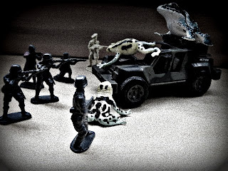
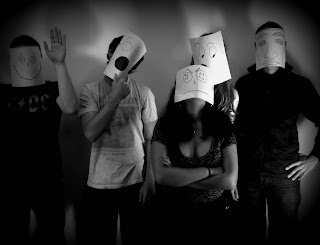
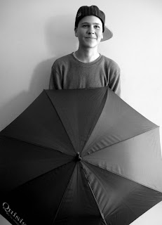
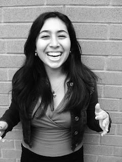
These are some of Carlos's best shots in my view. His first one displays me in my happy state that I am usually is. The photo shows a lot of emotion and feeling, even in black and white. The second picture shows his ironic dark humor with the frogs taking over and the men on the sidelines trying to protect themselves. The look is quite grungy and looks like a military picture. The third picture shows an ironic family and how each other them have their own personality. It is also in black and white and has a dark frame. The last one i think is simply amazing because it is creepy and beautiful at the same time. It looks like a movie poster for a scary movie. Most of these photos were posed and the first one was not. Carlos has an unique style that shows darkness and humor all in one.

Alastair:


She has a very unique style where she has ideas about reality that we do not always notice. A lot of her pictures have people involved that are interacting with another object. For example the one with the shoe, umbrella, wand. Her ideas are very clever and show that she is thinking outside the box: real v. ideal, little part of a big world. A lot of her photos are in black and white, but she is good with colors too. She likes light and uses many people in most of her photos. She is good at portraits and making people look different than they usually do. She has very precise and astute photos.


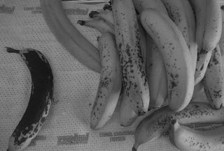
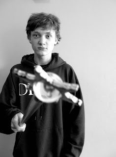
These photos show her ability as capturing peoples' personality with another object. I think these are some of her best pictures. The first one shows the concept of 'real v ideal,' it captures the beautiful ripe bananas and the old yucky one. It has a great idea, while still being a nice picture. The last three show that a person and their interaction with an everyday object. They are all very different, showing the varied personalities. All of these photos are happy and have a lot of light in them. The second to last one has great shadows. She doesn't seem to edit them too much and they all have a natural feel to them. All of these are in black and white and look really good.

Julian:


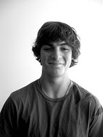
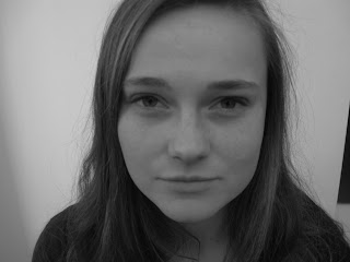
His photos consist of a lot of people, and most of them are portraits. He also likes to show objects at various angles that give them a interesting twist. Most of his pictures are in black and white. His big thing in his series seemed to be portraits. He used the idea of people standing really still and not showing any 'fake' emotion. A lot of these pictures show these peoples' true emotions and shows how everyone looks and acts differently. A lot of these photos were staged and have a quirky and cute style to them.


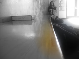
These photos show his ability to capture up close and faraway aspects of different people. The first two are of people up close. The first picture shows us that a close up shot of a person at a higher angle. It looks like she is slightly looking up at us. The second one shows a person at a straight forward angle and he is not smiling, but not giving us a blank state either. The last one shows us a great view of depth and how light, darkness and a splash of color can all looks really great. This picture has all the key elements to it and shows a story at the same time. First you see a path and it leads to a big book and then to a person at the very end reading another book. She is probably studying or doing homework. You see an exit in the background exuding light and the ground is covered in darkness. Julian's photos are very distinctive and have a good feel to them.

' GOOD JOB PHOTO CLASS OF 'IO ' :)

Friday, April 30, 2010

More OP


This is op art: a genre of visual art that makes use of optical illusion. Op art is different shapes and colors that make similar shapes that make it more abstract. As you can see all these pictures are repetitive of the same single picture. For example, in the last one you see orange shape, which was initially a single pic of a star burst wrapper. Through photo shop or a optical pyramid, I created OP art!

Tuesday, April 27, 2010

Monday, April 26, 2010